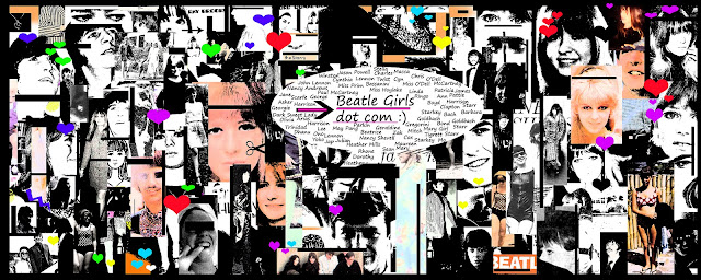
So this is the new layout version for the website. It took about 3 hours to do so I hope u guys enjoy it ! I really really like it only thing is that man Blogger never does quality photos for layouts and that SUCKS duuuude. So its just loads of pictures that I put into different squares on Adobe Photoshop 7, some in colours and some in black and white as u can see, just lots of photos from various events, holidays, etc etc like Tobago, magazines, Sunny Heights photoshoot, The Knack Premiere, etc. I merged and flattened my layers several times, put some black borders and even on the photos, put shapes like hearts and arrows and stuff. I went into filter, grain but without grain and just wanted the colors and the b and w to appear a lot darker and deeper, its my absolute favorite effect !! Then I just put up the BD bubble and if you look close enough you'll see the names of most of the girlfriends and all the wives along with their surnames, their children's names, their husband's names :) So it's the version 3, I still kept the old version the second one with the hearts because it was simple, all I did was took the hearts out a 60s magazine and grained them like I did on this one and then blurred it, but I liked it a lot it went well with the blog and everything.
So let me know how you like it and I hope you guys enjoy :)


2 comments:
love the new layout!
thanks so much I appreciate the feedback :) especially if its positive hehehe ;) xxxx enjoy
Post a Comment